Customizing HTML output
You've already learned how to create and write HTML views for a custom element type. The next step is to customize all the other HTML code that wraps around your elements, i.e. columns, rows and the whole post.
Layotter comes with a bunch of responsive HTML and CSS scaffolding for rows and columns to work out of the box. You may want to replace the scaffold with your own custom code, though. There are two ways to do this:
- Using the settings page – this approach works only for static HTML wrappers
- Using view filters – this approach is very flexible, you'll be able to change HTML output according to all kinds of parameters
Using the settings page
This approach is very straightforward. Go to Layotter's settings page and simply enter some HTML code into the corresponding fields.

Using view filters
To customize HTML for rows programmatically, write a filter function and hook it to layotter/view/row. The filter functions's parameter will be a string containing the row's content (i.e. columns and elements). It should return the customized row HTML as shown in the following example.
function custom_layotter_row_view($content) {
    return '<div class="row">' . $content . '</div>';
}

add_filter('layotter/view/row', 'custom_layotter_row_view');
The same goes for elements, columns and even whole posts. Simply change the filter name to layotter/view/element, for example. Read the chapter on view filters to learn more.
A slightly more complex example
Let's say you want to add a special class name to rows, but only for a specific post type. You could achieve this with the following code.
function custom_layotter_row_view($content) {
    if (get_post_type() == 'my_post_type') {
        return '<div class="row special-class">' . $content . '</div>';
    } else {
        return '<div class="row">' . $content . '</div>';
    }
}

add_filter('layotter/view/row', 'custom_layotter_row_view');
This example just scratches the surface of what's possible with view filters. To learn more, read the tutorial on how to create and use options.
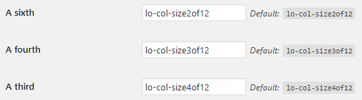
How to style columns
Columns are special in that they require CSS classes to "know" their supposed width and apply CSS styles accordingly. Looking at the settings page for columns, you'll notice a set of fields for class names for the different column widths.
If you decide to ditch the default CSS and write your own styles, you'll have to target these class names in your CSS code so columns actually take up the space they're supposed to. Something like this:
.my-3of12-class {
    width: 25%;
}
So what about CSS?
There's no special way to add CSS rules. Simply add them to wherever you keep all your other CSS code.